
PPreparing a traditional home for sale takes more than fresh paint and attractive furnishings. This West Highland Park project shows how a traditional home make-ready renovation, thoughtful interior design and professional home staging can work together to help a property appeal to the right buyers.
This West Highland Park home is a good example. The property had already been professionally staged, but it still wasn’t receiving offers. The homeowners reached out to me to identify what wasn’t working and determine which renovation, design and styling changes could better position the home for its market.
What began as a consultation became a strategic make-ready transformation.
Whenever I come out to a property, there are two aspects of the home I look at. If a home is already listed and it isn’t getting offers, we have to ask… what’s not working?
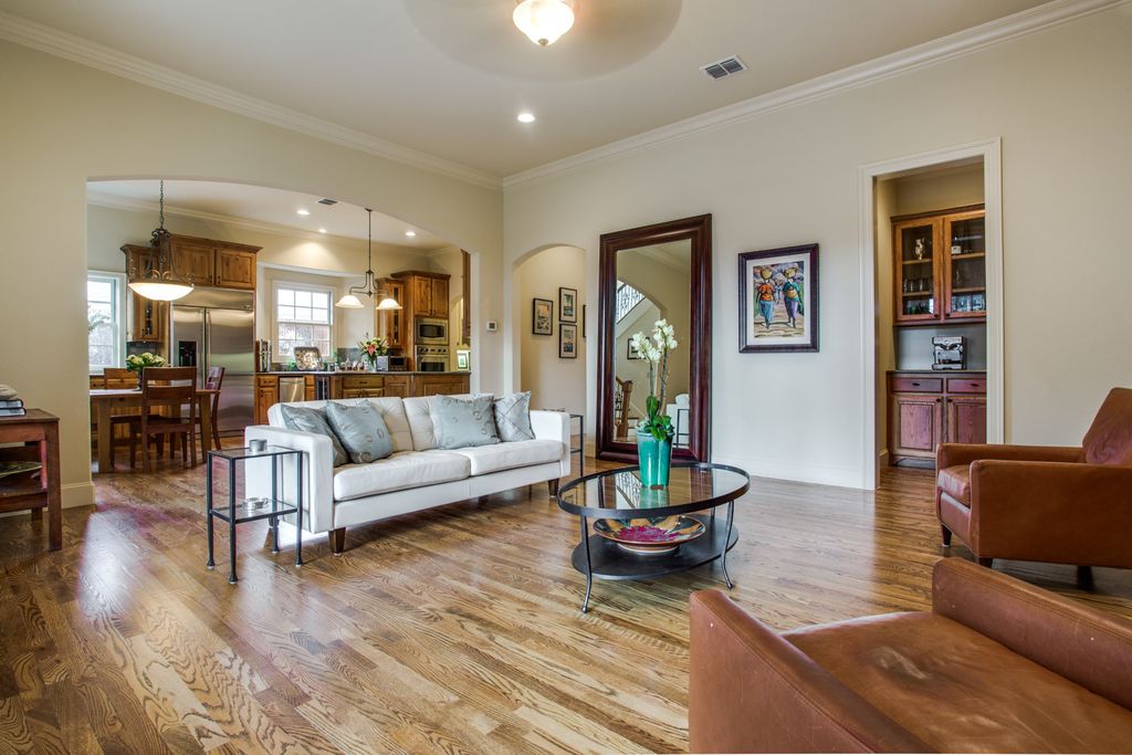
In other words, we have to diagnose the situation. In these clients’ case, we determined that the style and scale of the existing staging did not meet the home’s price point. Potential buyers were walking in and what they saw was not meeting their expectations.
The main problem we identified was that the fixed elements in the home, as well as some of the finishes and the home staging, did not match the price point of the home. It’s easy to cut corners and assume that potential buyers won’t notice, but the opposite is true. The disjointed feel of the home was off-putting and even made several spaces feel smaller.


So to recap the existing issues...
• the style and scale of previous staging did not meet the price point
• the mismatched color scheme created spaces that felt dated and disconnected
• the fixed elements of the home did not reflect the price point
Now, the second aspect I always consider for a home — what will make it irresistible to ideal buyers?
The answers to this question, as well as to the ones above, give us a good direction for which updates will need to be made. Can you guess what we did in this space?
...what we changed, why we changed it, and how those decisions helped the home present more cohesively to prospective buyers.
Before developing the interior styling plan, I had to find an on-trend wall color to match the existing trim color (this is one trick that saved our clients lots of money because painting baseboards and crown molding, doors and door frames...lets just say it adds up pretty quickly) and update the entire look and feel of the home. Fortunately, I spent considerable time becoming a Certified True Color Expert™ — so finding the right color was a very easy decision to make!
In addition to the walls, we also painted the kitchen cabinets, the wet bar, and the millwork in the living room. These made a HUGE difference to the impression of the space.
We also swapped out the light fixtures in the common areas of the house with more on-trend and style-appropriate finds. These did not break our clients’ bank account and all added up to the new luxury look and feel of the home.
But I won’t let you just imagine it… let’s look at some Before & After photos.
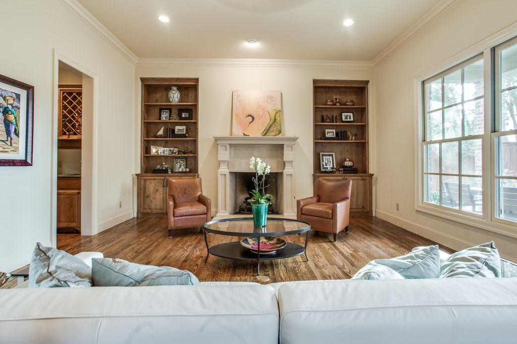
The style and scale of the furnishings (who has conversations that far apart?) and the dark millwork and the wine bar to the left, made the space feel smaller and closed off.
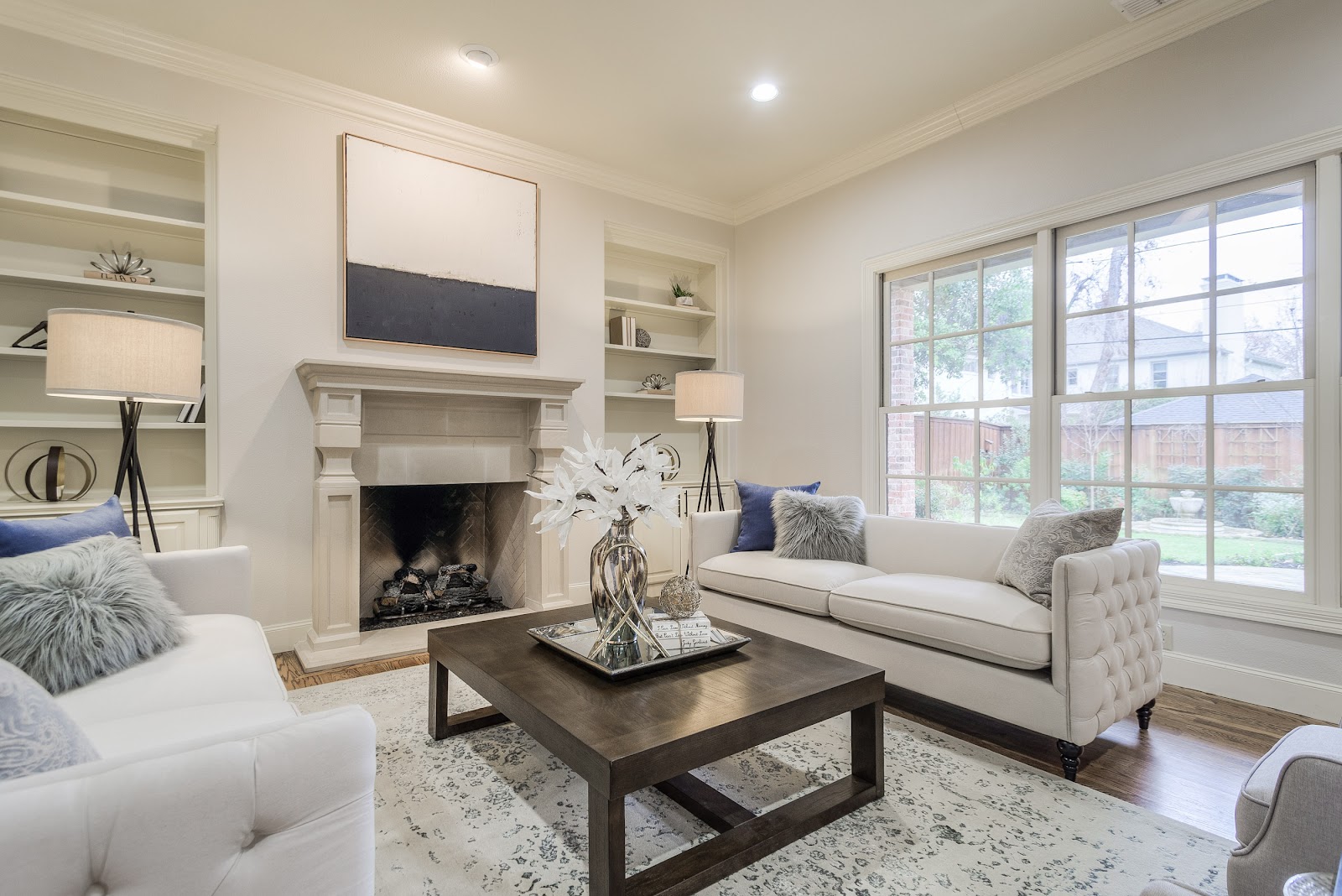
In the updated living room, a lighter finish on the built-ins immediately brightened the space, while appropriately scaled furnishings created a more intentional layout. Traditional details, mixed metals and a properly sized area rug gave the room a more polished, cohesive feel that better reflected the home’s architecture and price point.
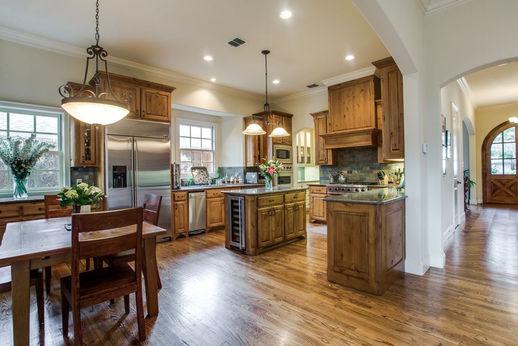
Before, the kitchen’s heavy wood cabinetry, darker finishes and traditional fixtures felt disconnected from the rest of the home and didn’t reflect the expectations buyers would have at this price point. Rather than replacing everything, we identified the existing elements that could be transformed strategically to create a lighter, more cohesive look while controlling renovation costs.
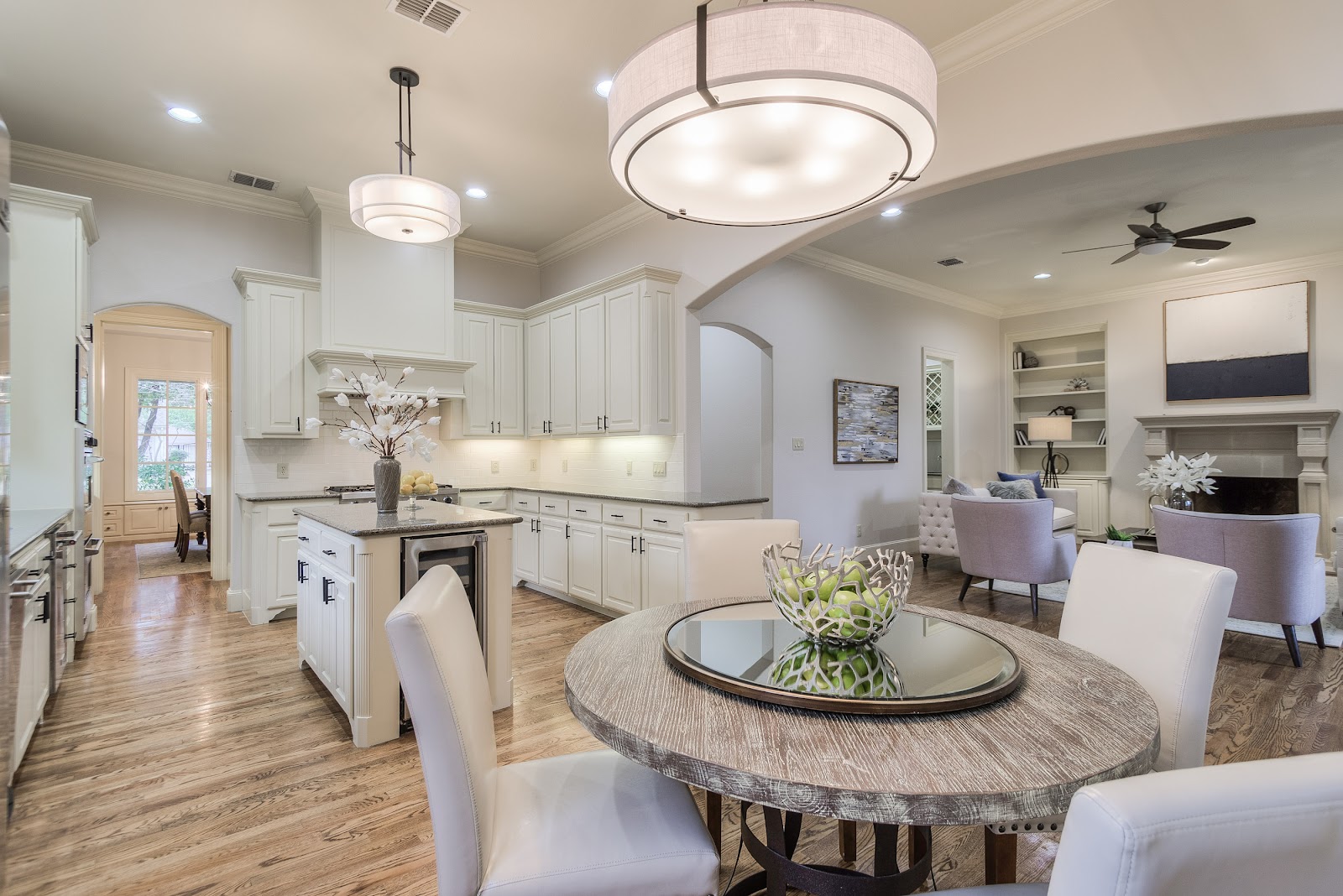
Painting the existing cabinetry and updating the lighting dramatically changed the kitchen without requiring a complete remodel. Lighter finishes visually opened the space, while appropriately scaled furnishings and oversized light fixtures helped define the kitchen and breakfast area and gave the entire space a more polished, current feel.
Just as importantly, the kitchen now connected visually with the adjoining living areas. Instead of experiencing each room as a separate space, prospective buyers could more easily imagine how the home would function for everyday living, entertaining and working from home.
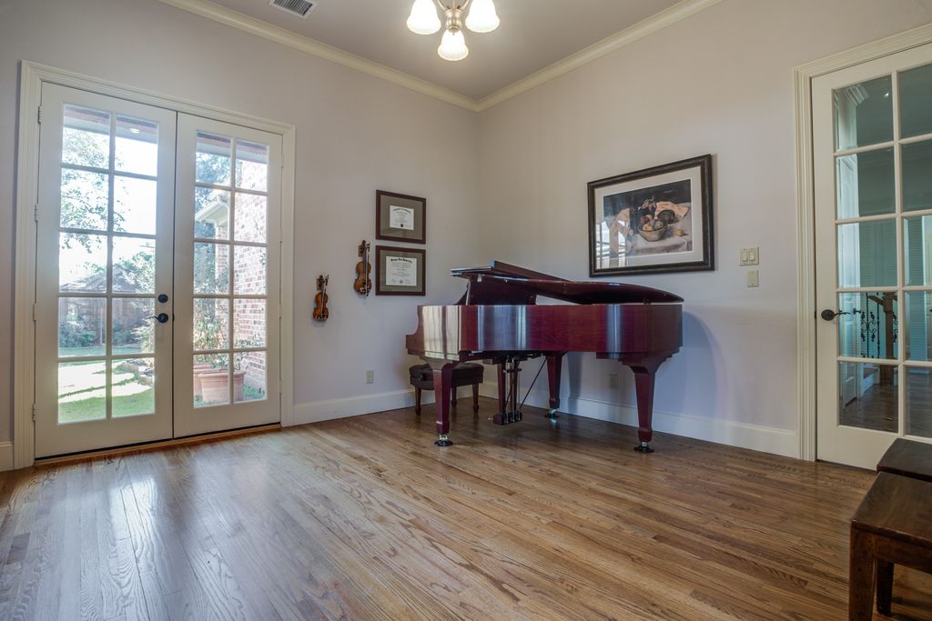
Before, this room had very little defined purpose. A piano was tucked into the corner and was barely visible when looking into the space. When I toured the property, I immediately recognized an opportunity to present the room as a functional home office — giving buyers a clear reason for the space and helping them understand how it could be used.
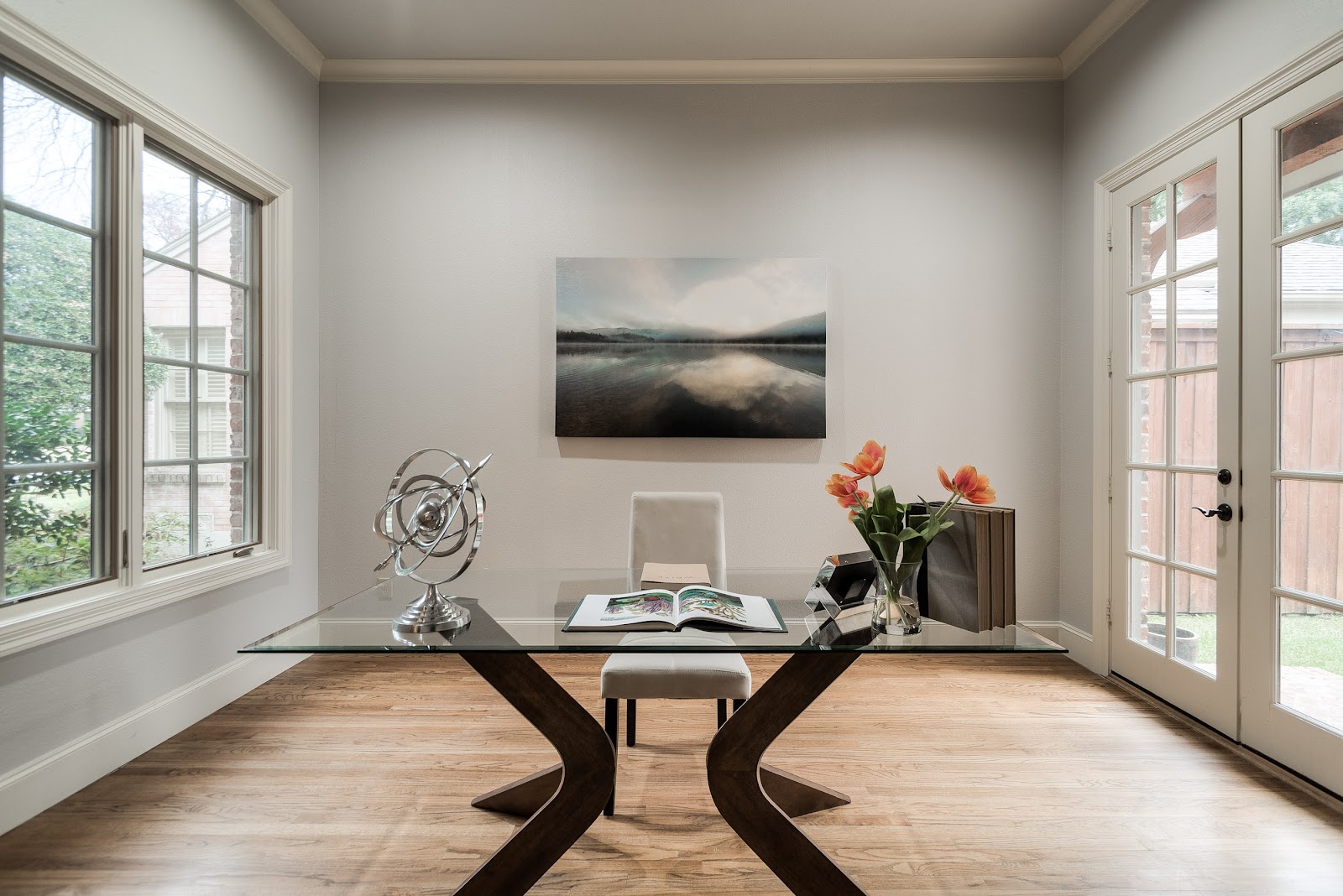
The transformation gave the room an immediate sense of purpose. A properly scaled desk, streamlined furnishings and simple artwork made the space feel open, intentional and spacious without requiring a major investment. For a make-ready project, that’s an important distinction: every room should communicate its function clearly while allowing prospective buyers to imagine themselves living in the home.
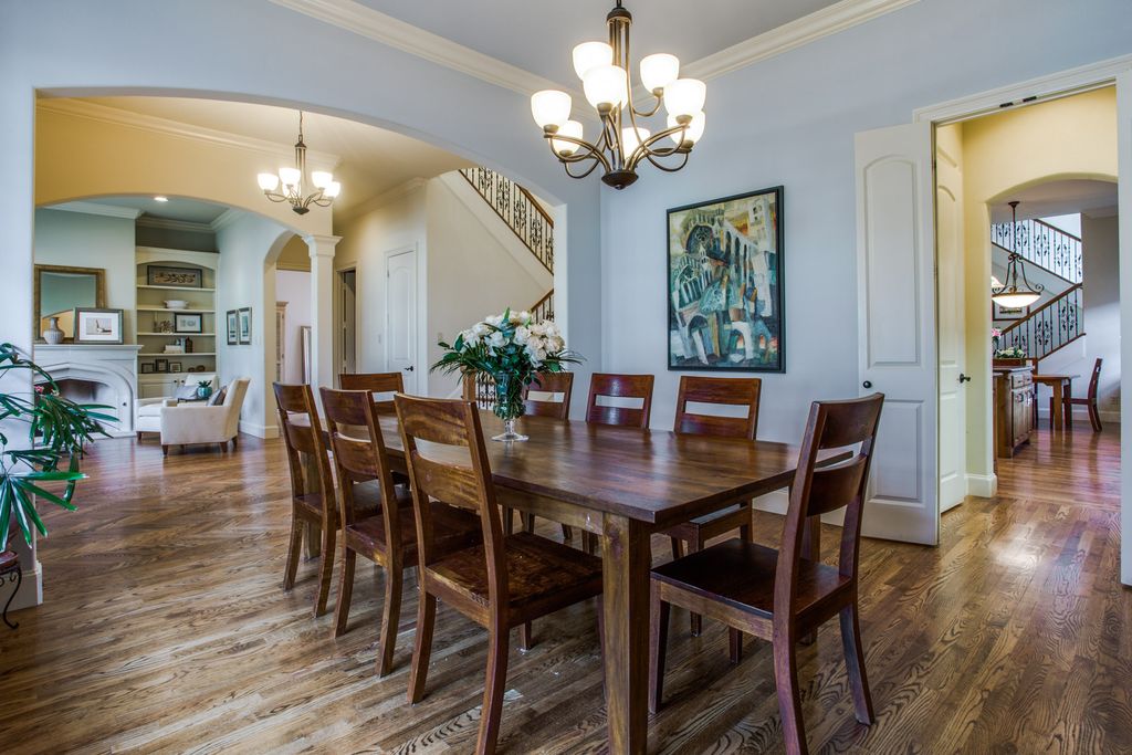
The dining table was oriented against the proportions of the room, making the space feel more cramped. Multiple paint colors also visually chopped up the adjoining spaces, while dated lighting and darker furnishings added to the visual weight.


Reorienting the dining table to work with the proportions of the room immediately improved the layout and circulation. Using one consistent, lighter paint color throughout the adjoining spaces eliminated the visual breaks, allowing the eye to travel farther and making the entire area feel larger, brighter and more cohesive. Updated lighting and appropriately scaled furnishings completed the transformation.
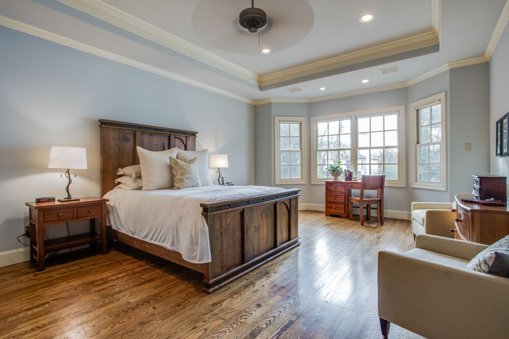
The existing furnishings felt mismatched in scale and style and didn’t create the polished, cohesive look expected at the home’s price point. The blue-gray wall color also competed with the warm wood floors and architectural details, preventing the room from feeling as spacious and refined as it could.
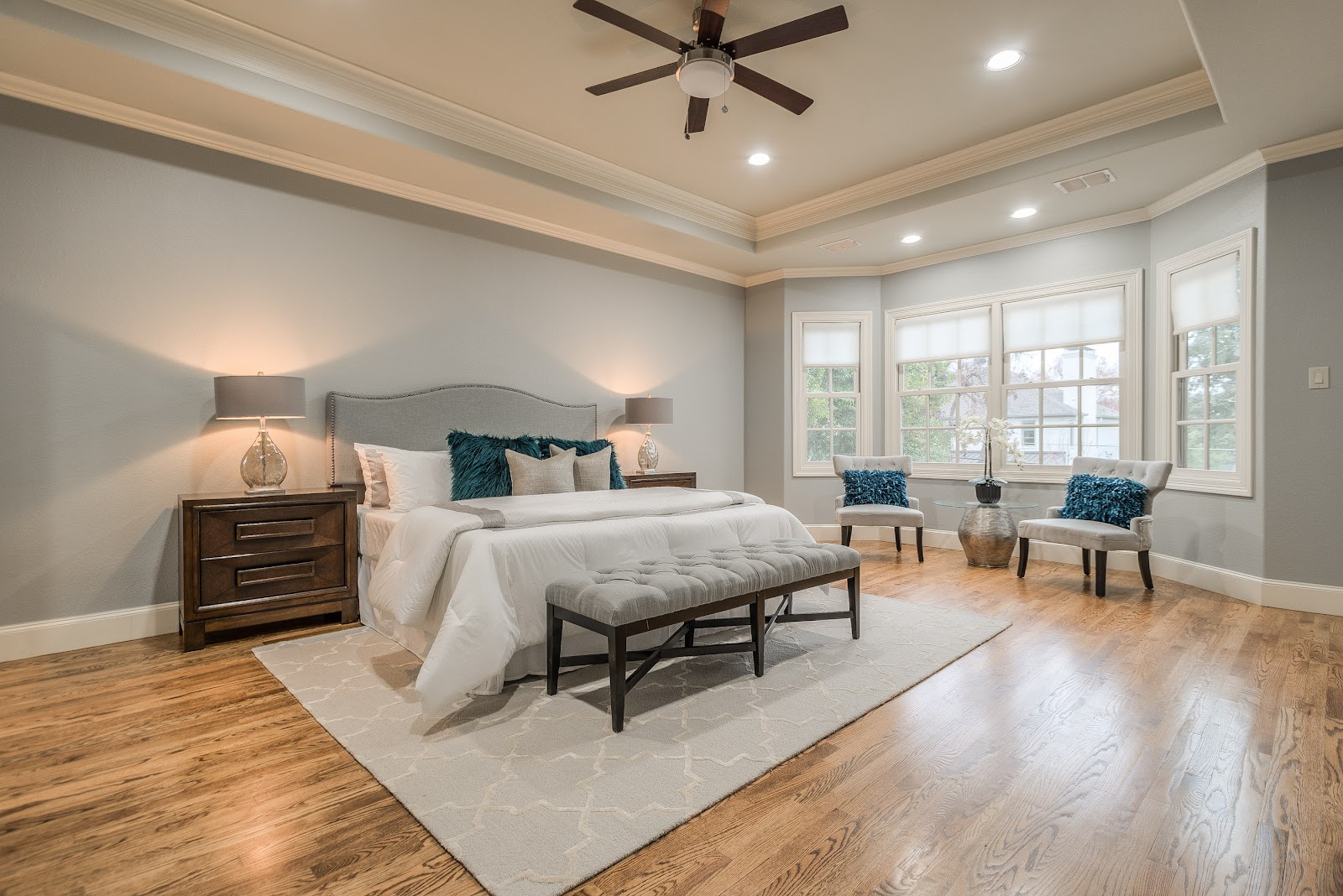
A more cohesive paint color, appropriately scaled furnishings, substantial bedding and a large area rug transformed the room without changing its architecture. The new layout better defined the sleeping and sitting areas while allowing the size of the primary suite to become a selling feature. This is where strategic make-ready decisions matter: the goal isn’t simply to furnish a room, but to help buyers immediately understand its scale, function and potential.
Whoops! Forgot to grab a Before photo of this space. But wait until you see the After…
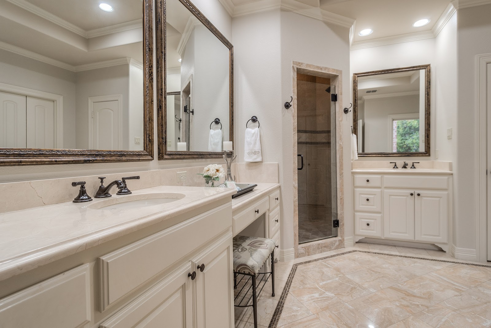
The finished primary bathroom feels brighter, calmer and more cohesive. A consistent wall color brings the countertops, flooring, cabinetry and hardware together, while minimal styling allows the finishes and generous scale of the room to speak for themselves. The result is a more polished primary suite that feels appropriate to the home’s architecture and price point.
So, the big question… how well did this home sell?
This home had been sitting on the market for months without an offer before the owners reached out to Design by KETI. The problem wasn’t simply the furnishings. The home needed strategic updates that better reflected its architecture, price point and the expectations of prospective buyers.
After completing the targeted renovations, updating the finishes and lighting, improving the color palette, and thoughtfully styling the home for the market, the response changed dramatically.
• The property received significant interest within days of being relisted.
• The first buyers who toured the home bought it.
• The homeowners recovered their investment in the improvements — and then some.
That is the value of a well-planned make-ready. It isn’t about renovating everything or spending money unnecessarily. It’s about identifying the changes that will have the greatest impact and presenting the home in a way that supports its value.
If you’re preparing a Dallas home for sale, Design by KETI can help determine what to update, what to leave alone, and where your renovation dollars are most likely to make a difference.
Warmly,
Keti


About the Author
Keti Abazi is an award-winning Dallas interior designer and renovation professional known for creating timeless, livable spaces and helping homeowners make strategic design decisions that support both how a home lives and its long-term value.
8 Dallas Renovation & Redesign Before-and-Afters — READ THE ARTICLE
Before You Decorate or Renovate: What Actually Matters in Home Design — READ THE ARTICLE

